ARWell PRO Re-Design
ARWell PRO is an immersive exercise app for healthcare providers and their patients. By gamifying the experience of physical therapy, patients are more engaged during sessions.
ARWell PRO is being redesigned for a more intuitive user experience. The new therapist dashboard will allow busy healthcare providers to quickly navigate the app while highlighting key features that are available to them. This project aims to elevate ARWell PRO from a functioning prototype to a polished product.
This project resulted in the release of collaborative games with Sesame Street, and an accelerated partnership with Niantic’s Peridot.


Duration
9 months
Role
UX Designer
UI Designer
Researcher
Collaborators
Theresa Fitzgerald, Design Consultant
Lisa Blake, Director of Product
Amy Pratt, Physical Therapist
Tools
Figma
Adobe Illustrator
Adobe Photoshop
Buried Key App Features
ARWell PRO is a medical device offering unique tools for therapists, allowing them to manage patients, create and assign therapy programs, and access session data.
User testing revealed that the previous user experience made these key tools difficult to find, discouraging therapists from using them. The tools were so buried in the navigation that some therapists were unaware they existed.
Additionally, design accessibility issues arose when the user’s live camera feed was used as the app’s background.

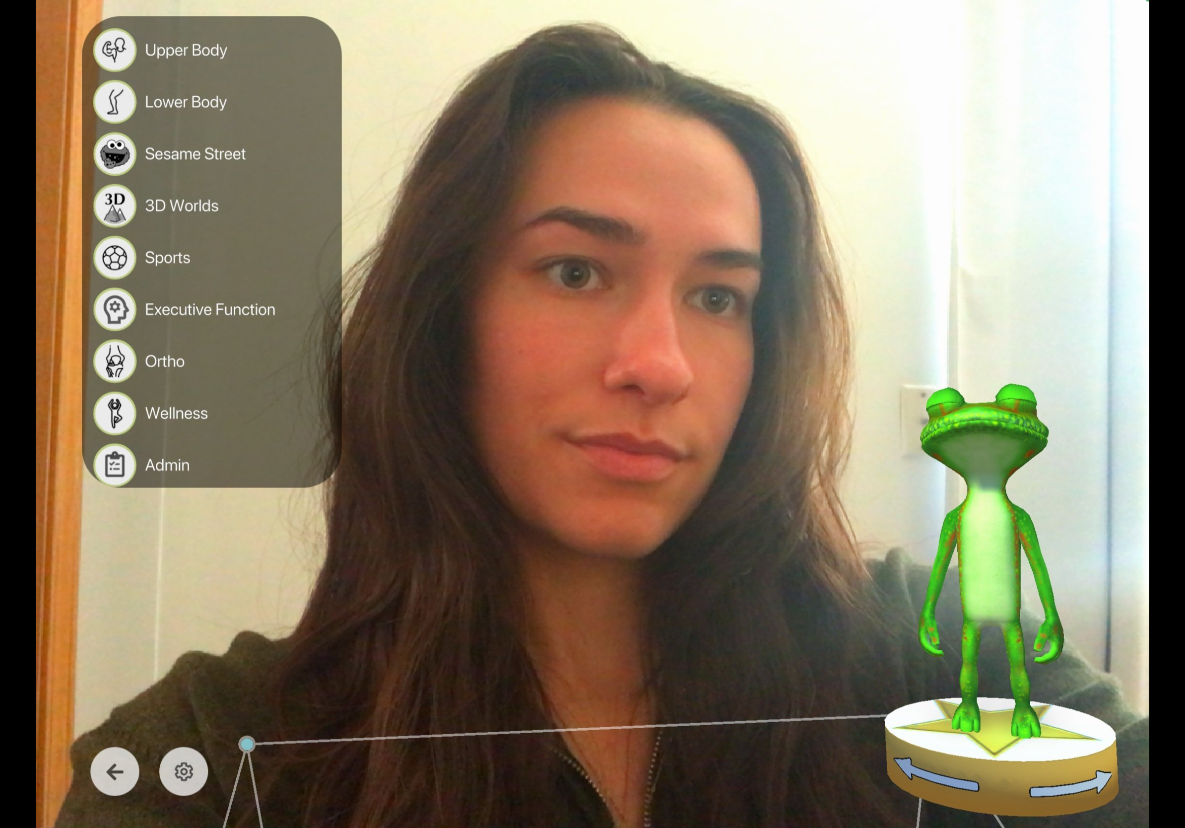
Lifting Key Features
The previous user experience placed key therapeutic tools under an “Admin” section within the game menu. Many therapists overlooked this area entirely, while those who found it struggled to relocate the tools later, leading to a drop in usage.
To iron out the user experience, we grouped related functions together and established a clear hierarchy, bringing key tools forward in the application.


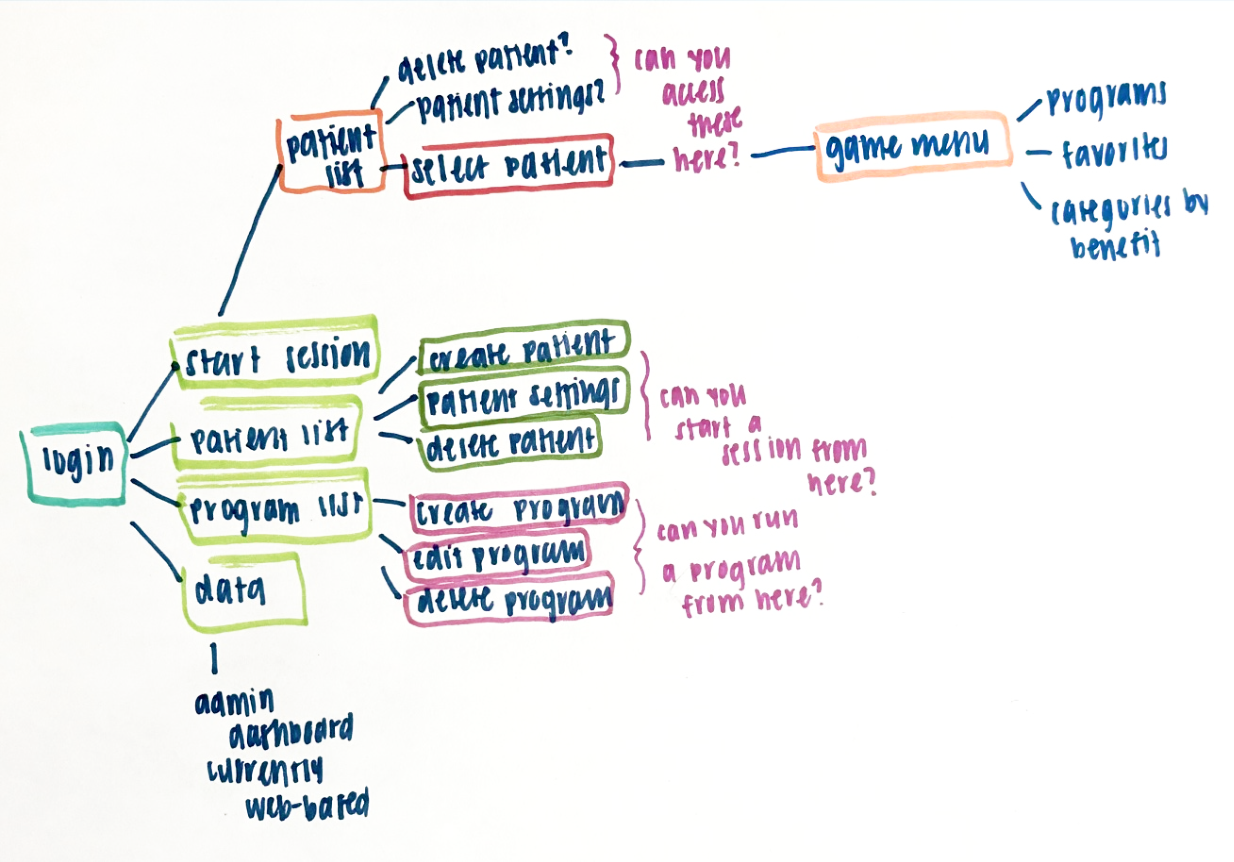

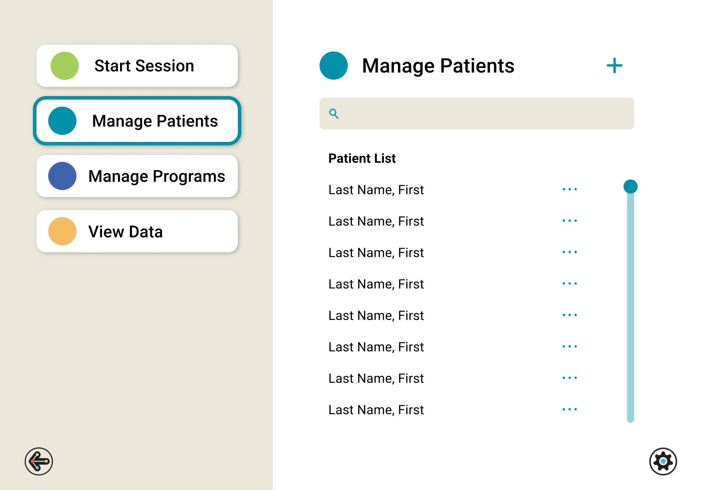
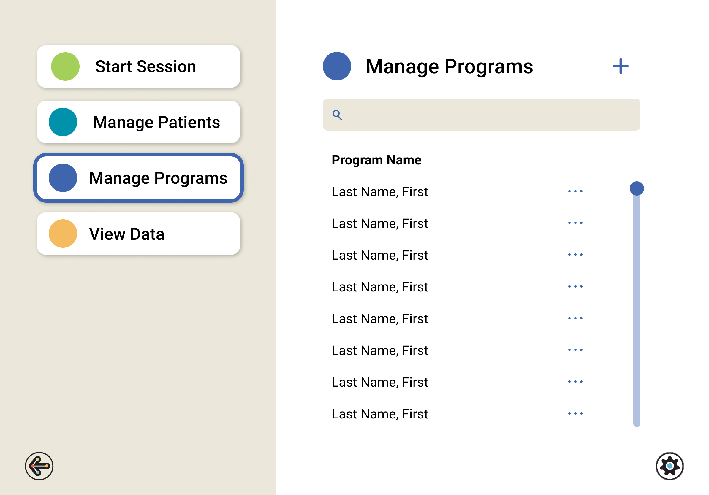
The Therapist Dashboard
To align with the updated user experience, we designed a dashboard for therapists. This screen pulls the therapist’s patient list, programs, and data dashboard to the front of the application. Allowing for easy navigation after login and an intuitive interface, while immediately highlighting key tools for users.


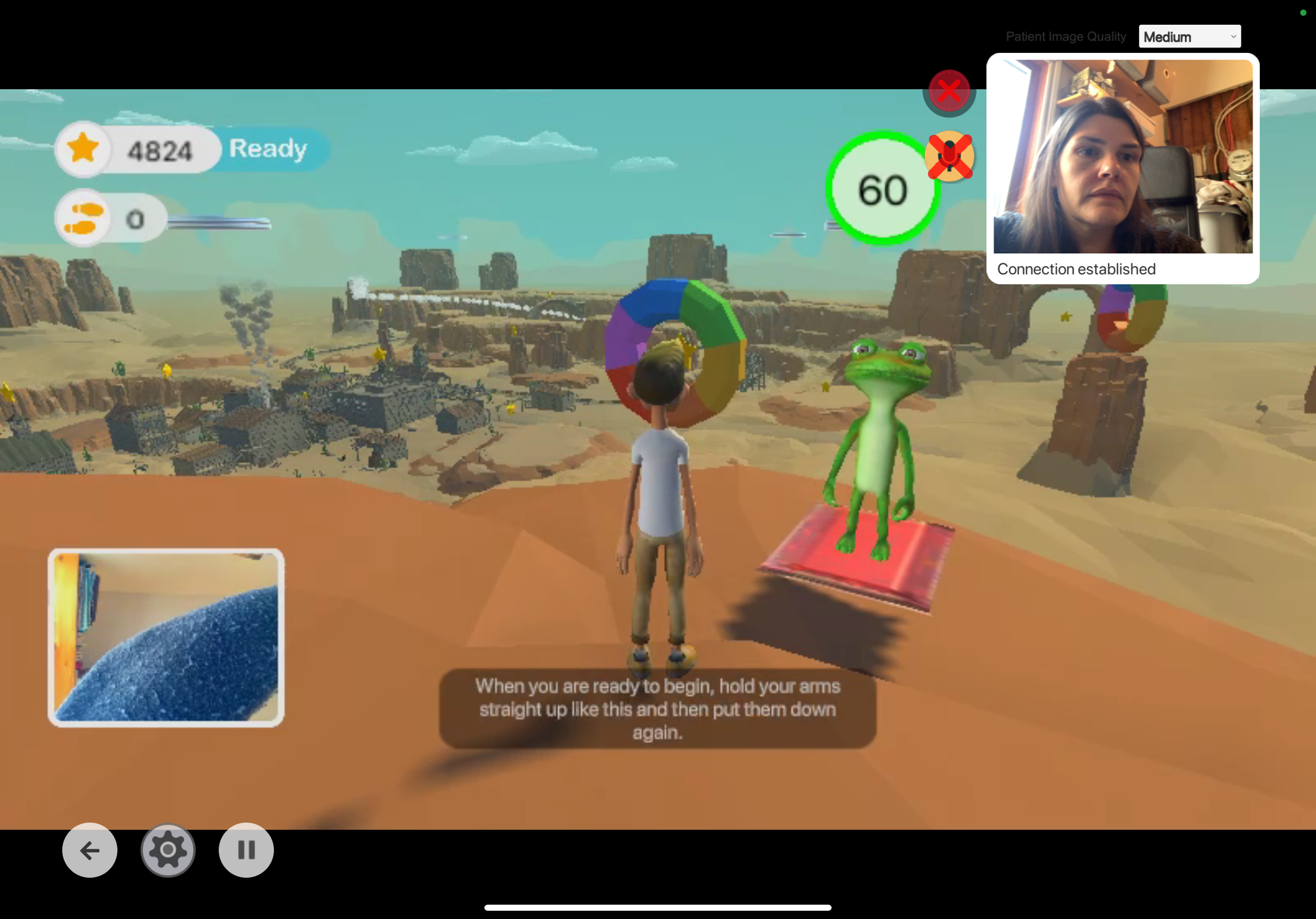
Telehealth
The previous telehealth experience was difficult for users to navigate. The screen had many UI components competing for space, while also missing key features of a virtual communication platform. Accessibility was also impacted by using the patient’s camera feed as the background, making on-screen content difficult to distinguish.
We drew inspiration from familiar video conferencing platforms like Zoom and Microsoft Teams to better understand the functional needs of both therapists and patients. This led to the creation of an in-session toolbar, allowing users to easily mute their microphones, disable their video, and control audio during telehealth sessions.
We designed a telehealth landing page that displays both the therapist and patient camera feeds, along with access to the redesigned game menu.


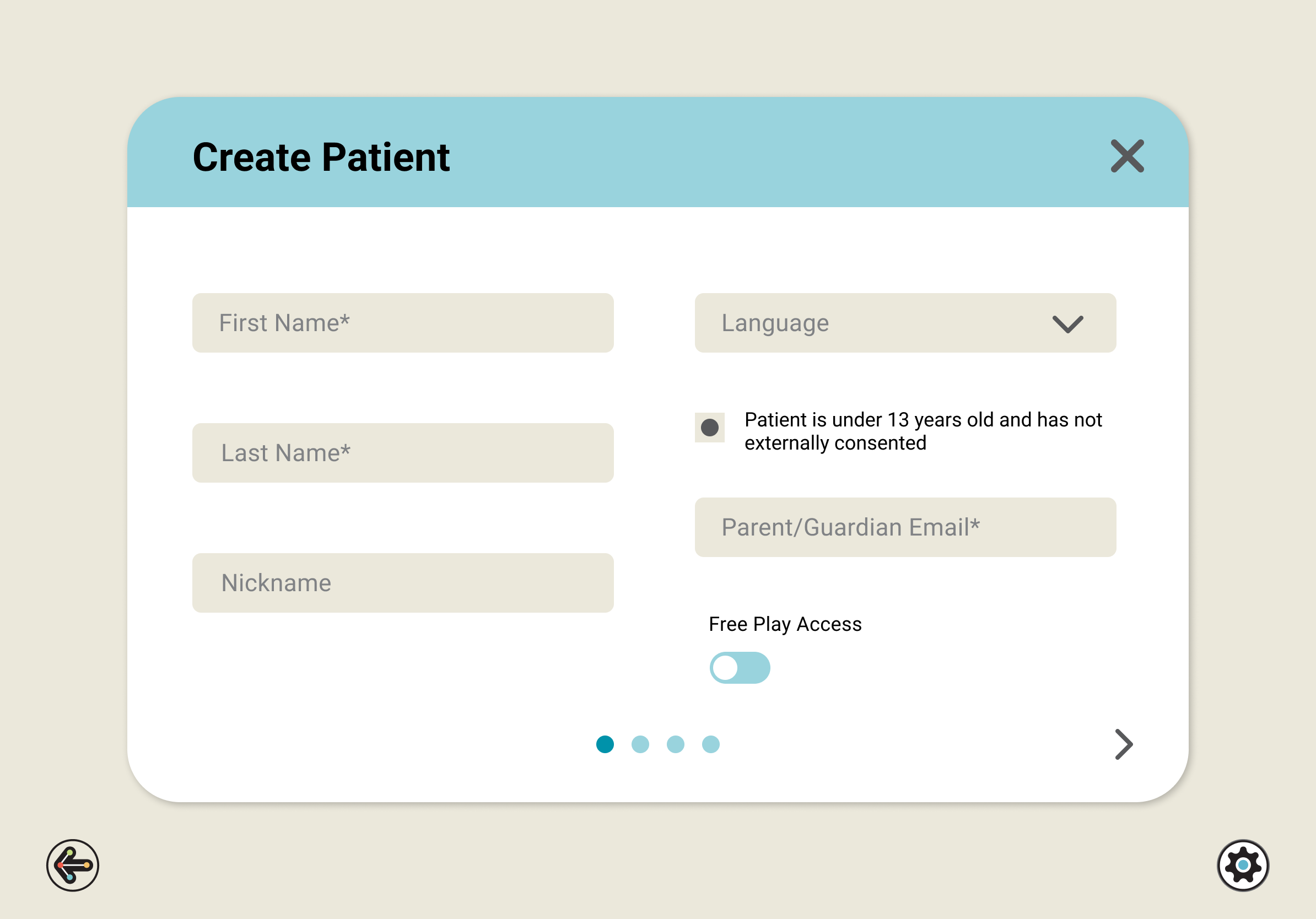
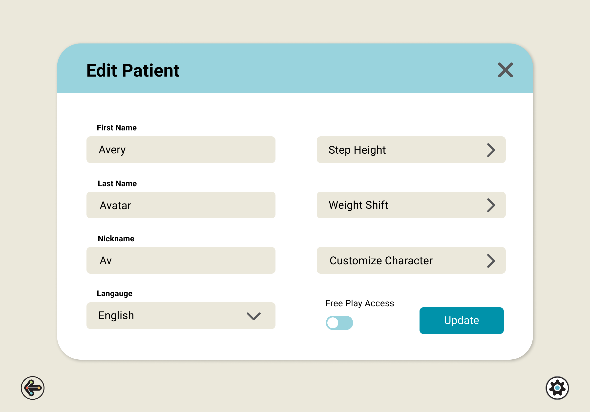
Managing Patients
Therapists can now create or edit patients, search their patient list, and remove users they no longer work with, all within the application. Previously, this had to be done within an admin portal on a web browser.
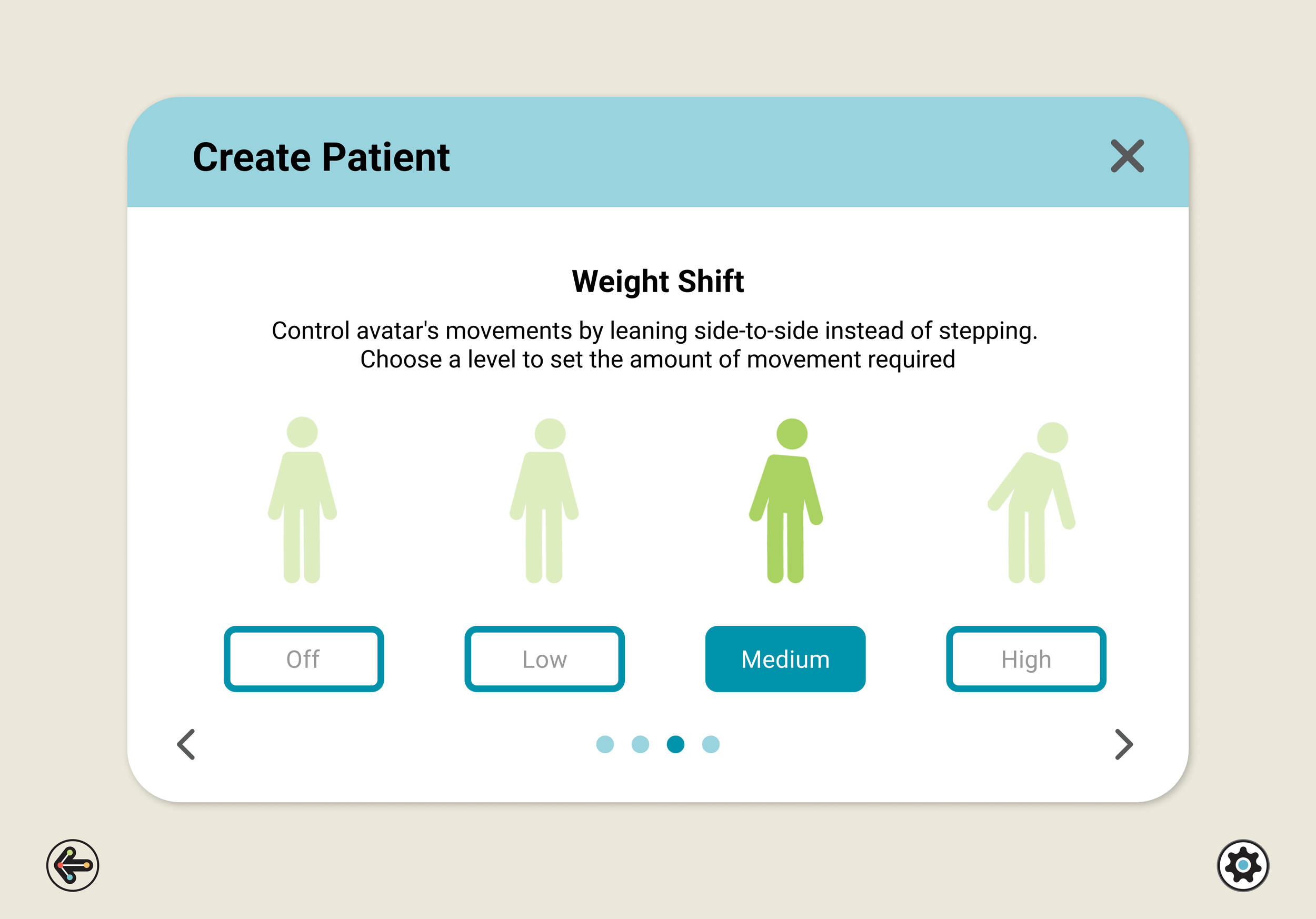
The patient creation process is now simpler and clearer for therapists. Visuals were added to clarify key accessibility settings that were previously difficult for users to understand.
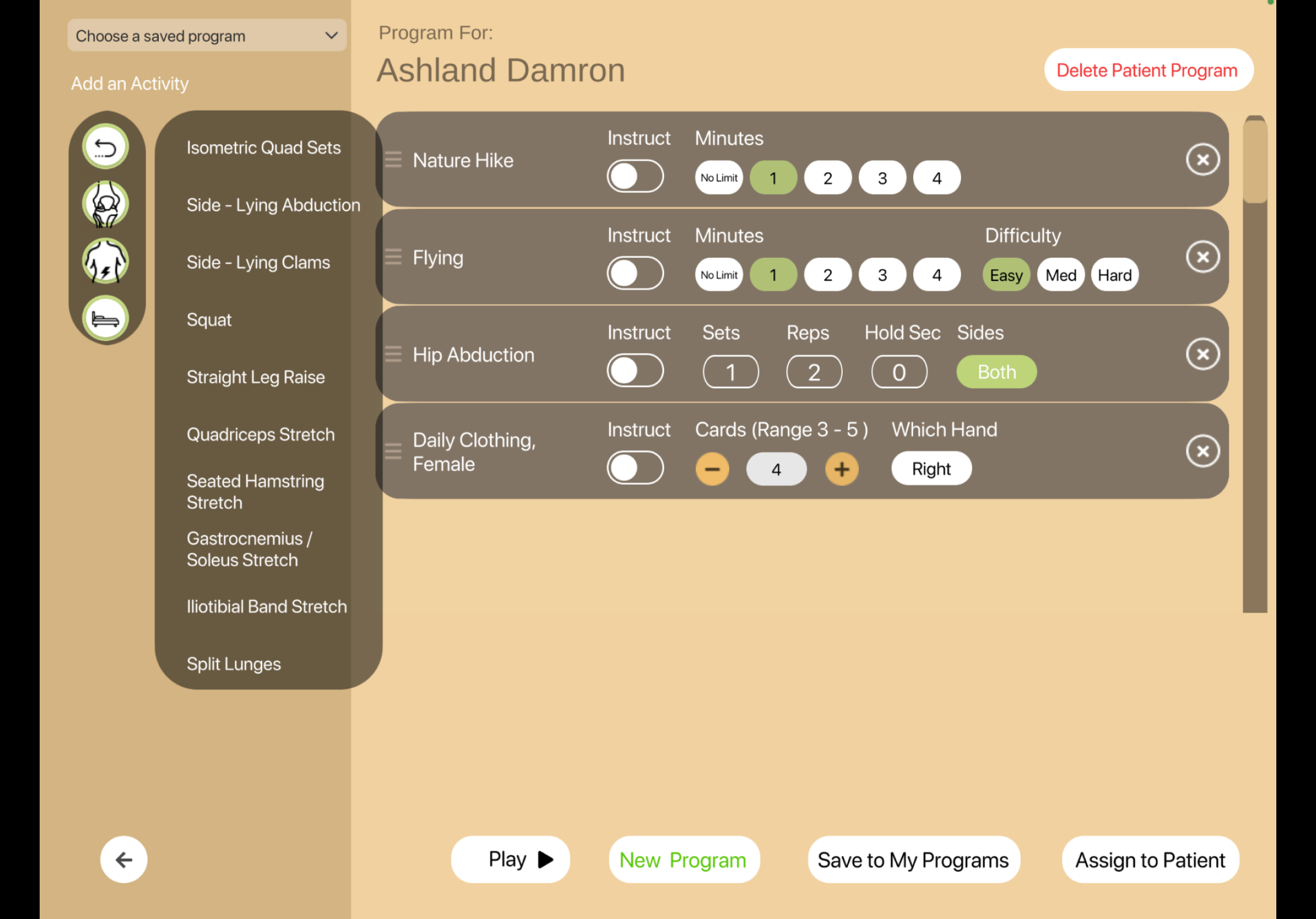
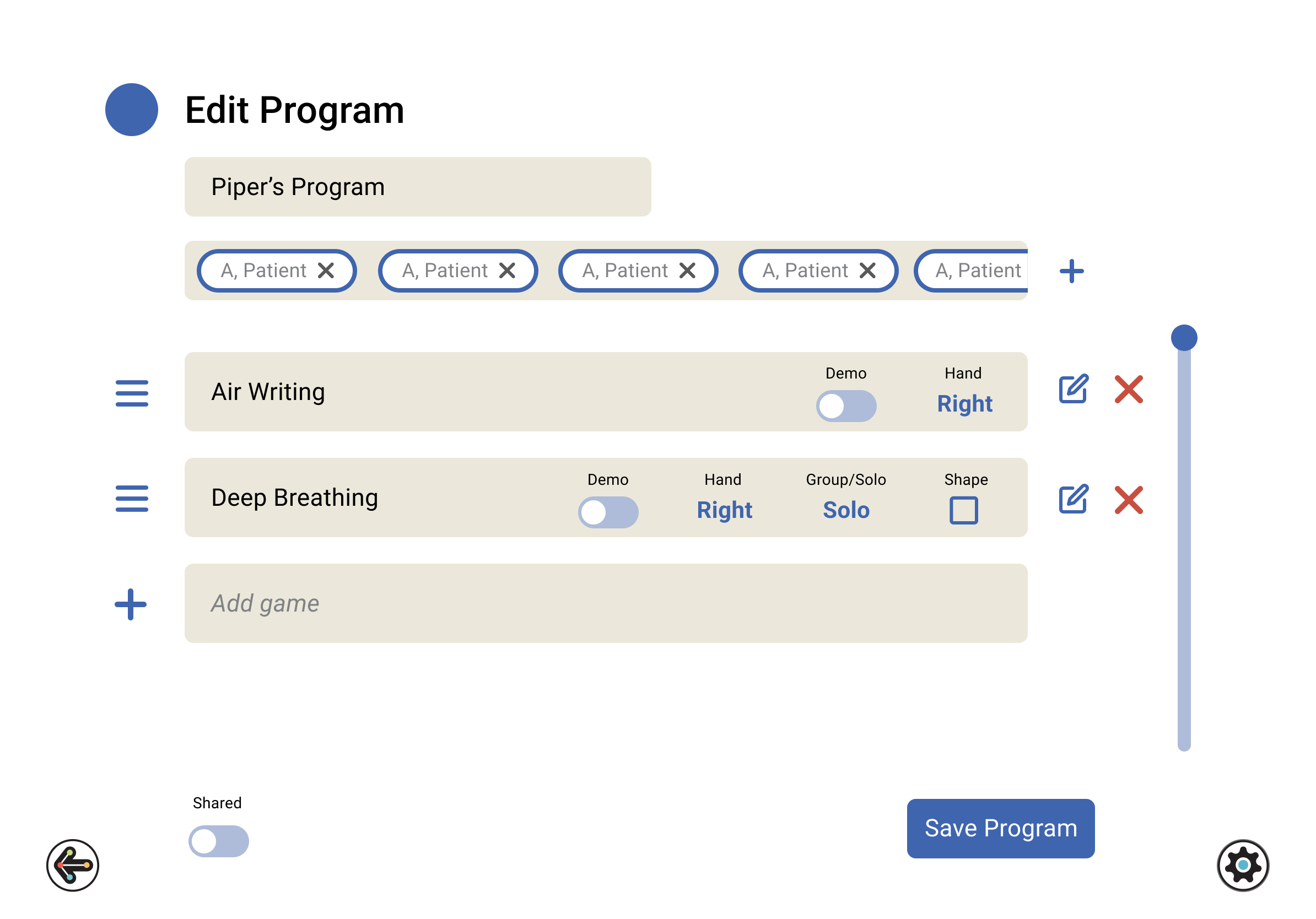
Building a Program
Previously, therapists had to select a patient to access the program function from the game menu. Now, they are able to access programs immediately after logging in, with options to edit, delete, duplicate, or create new ones.
Creating a program was a major pain point for therapists. The screen was cluttered with buttons and UI, making it difficult for them to know the next step. At times, they also needed to create programs that were not specific to one patient, but rather could be assigned to multiple, which was snot possible in the previous UX.
To simplify program creation, we removed the game menu from the main screen and made it a pop-up that appears when the therapist selects to add a game. With clear indicators of how to edit, delete, or reorder games within a program. The UI for exercise parameters and assignment functions was redesigned for a cleaner, more intuitive user experience.
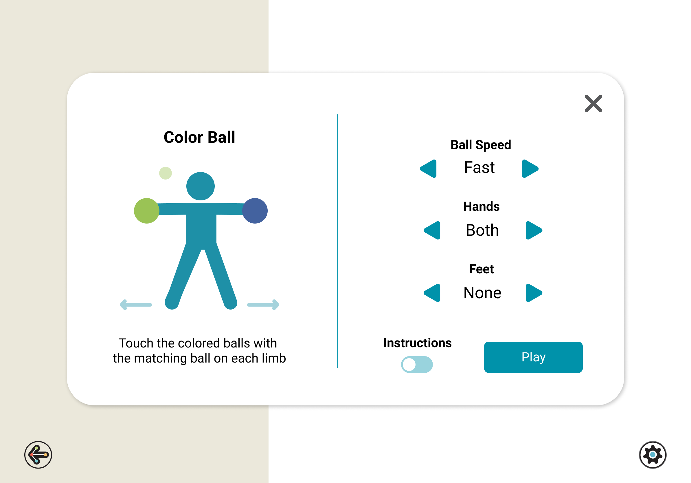
Instruction & Parameter Pop-Up
When selecting a game, therapists had no way to learn about the function or mechanics of an exercise before selecting it. During user testing, many therapists identified this as a painpoint. They often opted to replay the same few games over with patients, knowing the game play and therapeutic benefits, rather than taking up session time trying to explore and understand new exercises.
Now after selecting a game, an instructional pop-up appears, providing brief instructions and a visual of the game mechanics. A system of over 50 icons was developed to support this.
The new UX for this feature allows therapists to quickly gather information on an exercise before making a selection. The parameters for each game also live here, with an updated and more intuitive UI.

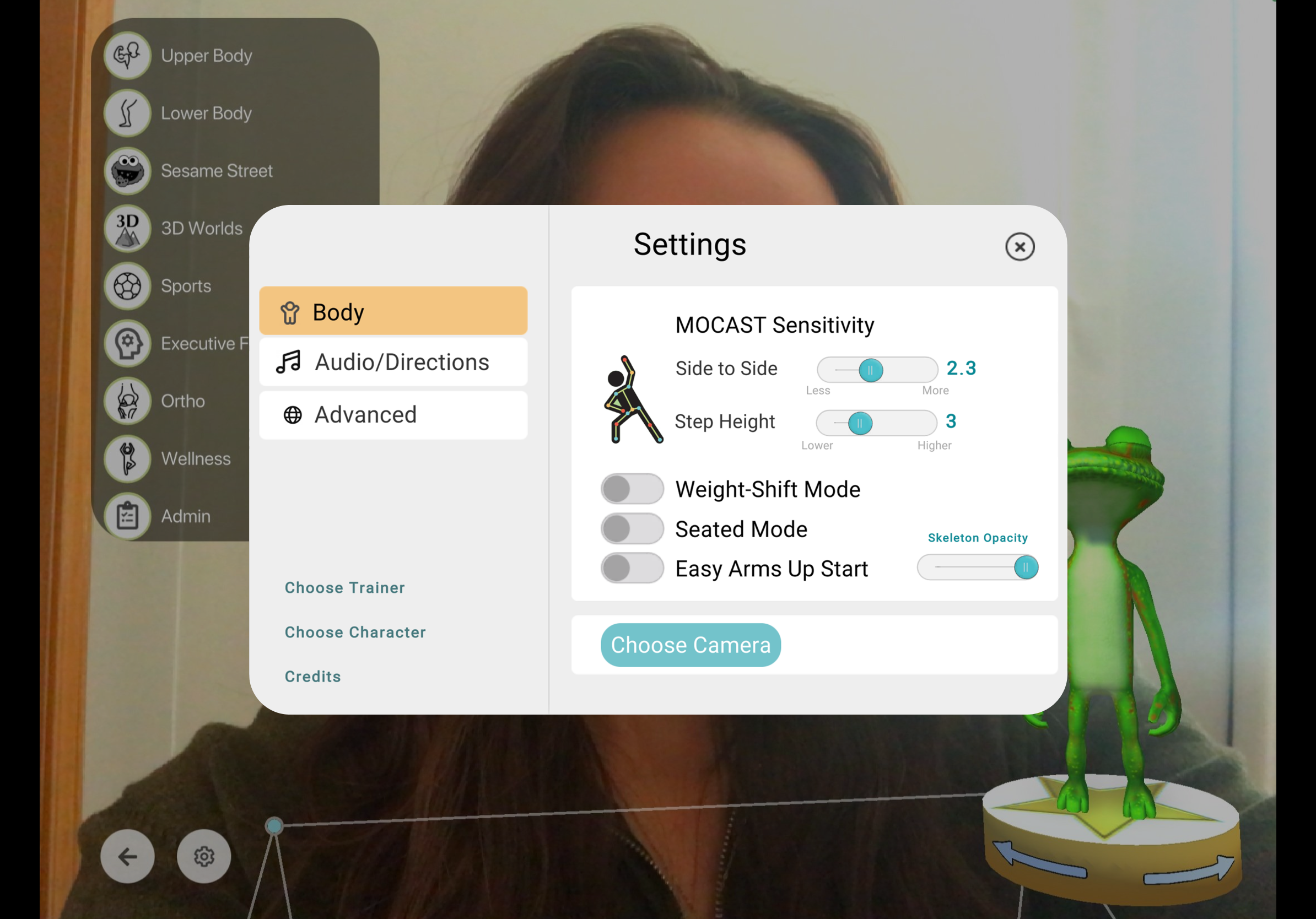
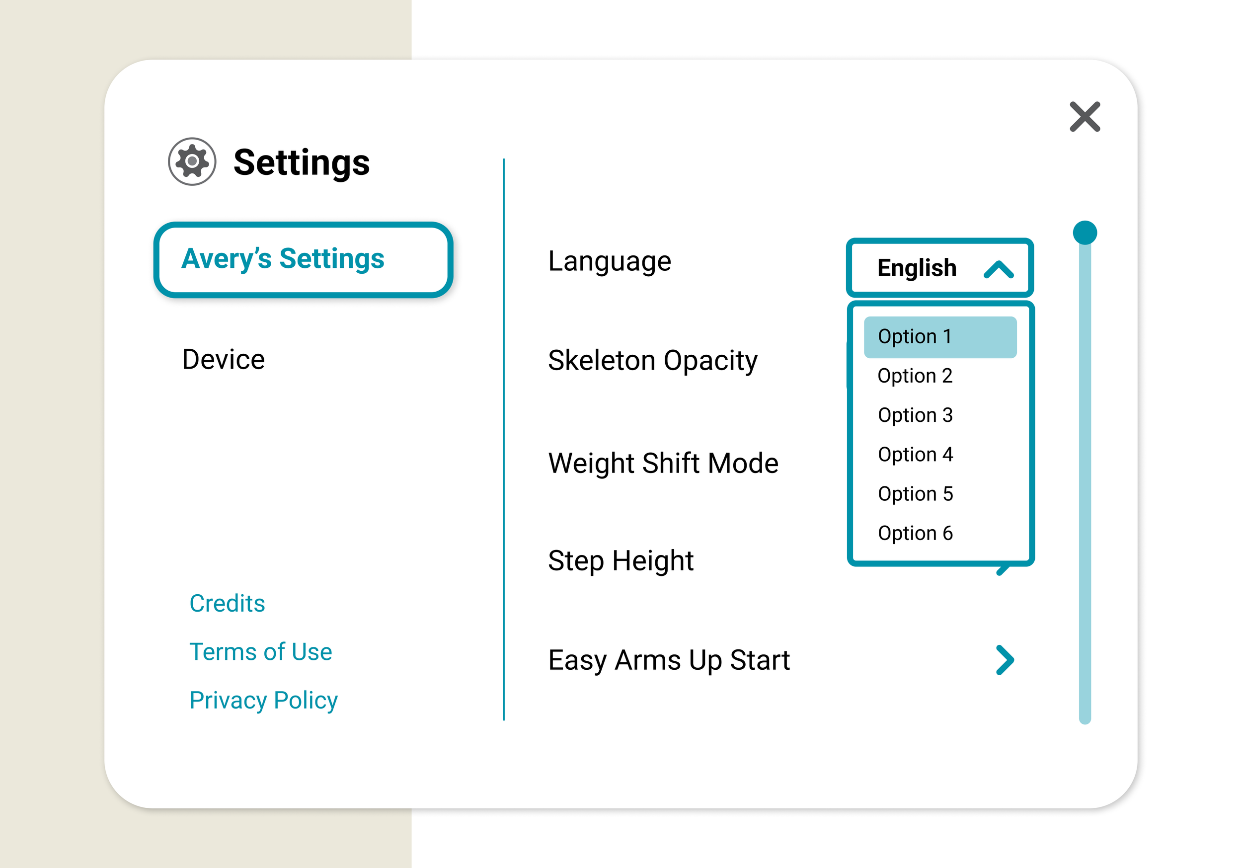
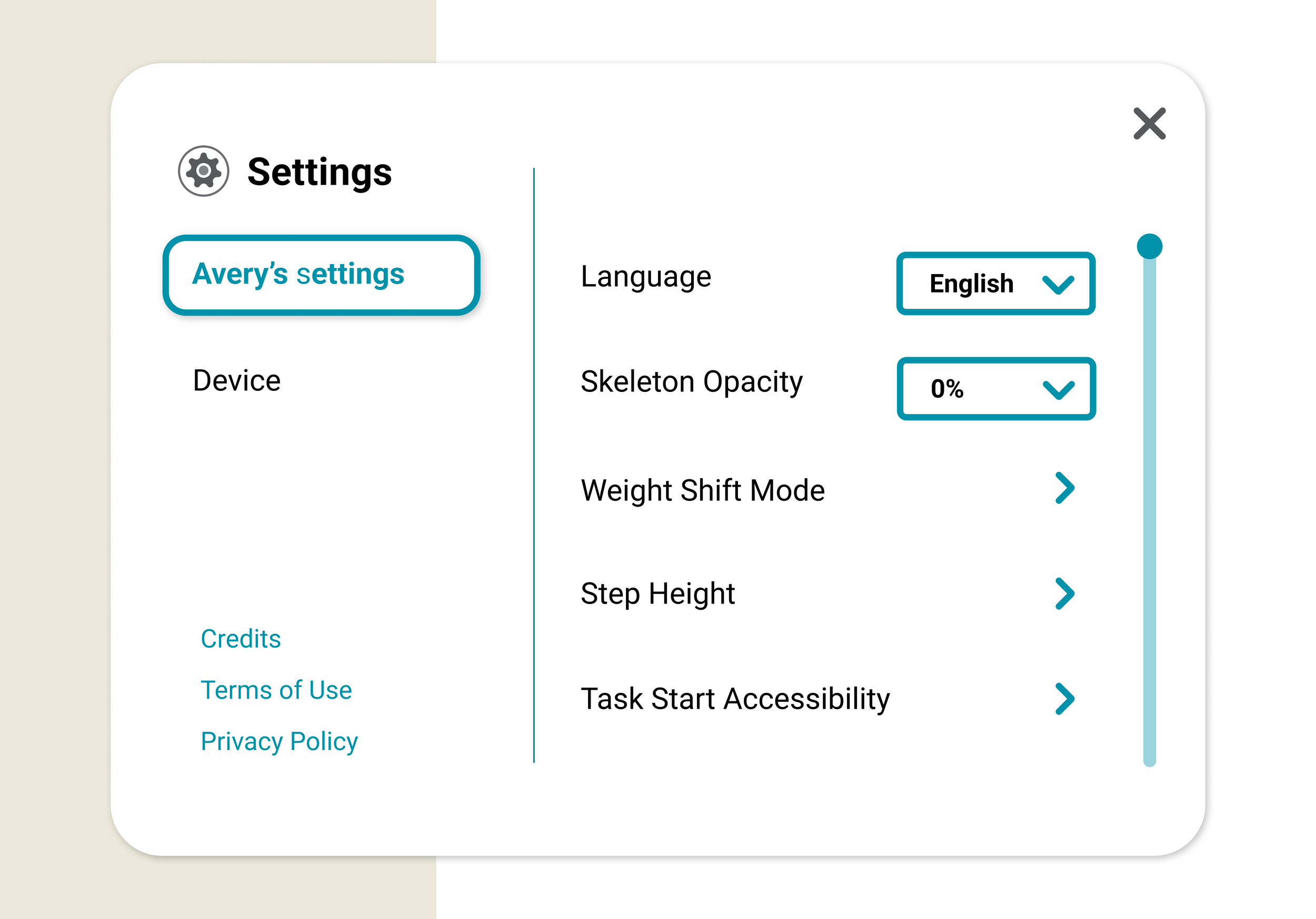
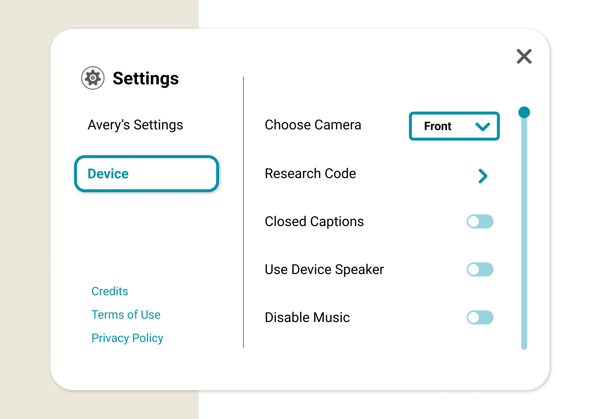
Application Settings
We redesigned the settings screen to improve clarity and accessibility. The new layout organizes settings into two distinct sections with intuitive controls, reducing cognitive load and enhancing the in-session experience.